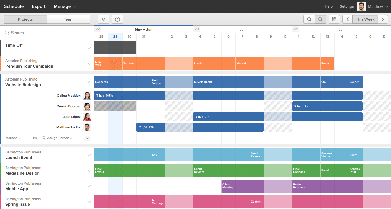
Time tracking with Harvest helps teams understand their present and their past, but what about their future? How do they plan their time? This was the question that set us on a course to develop Forecast, a companion app with the ability to plot your team’s upcoming assignments along a horizontal timeline.
Between 2013 and 2018, Forecast was created and maintained by a small team that consisted of just the CEO, myself, and four great engineers. I was the product lead, responsible for all things product: strategy, research, project management, design, UI & UX, HTML & CSS, beta communication, and even customer support at times. For those few years, Forecast was my baby.
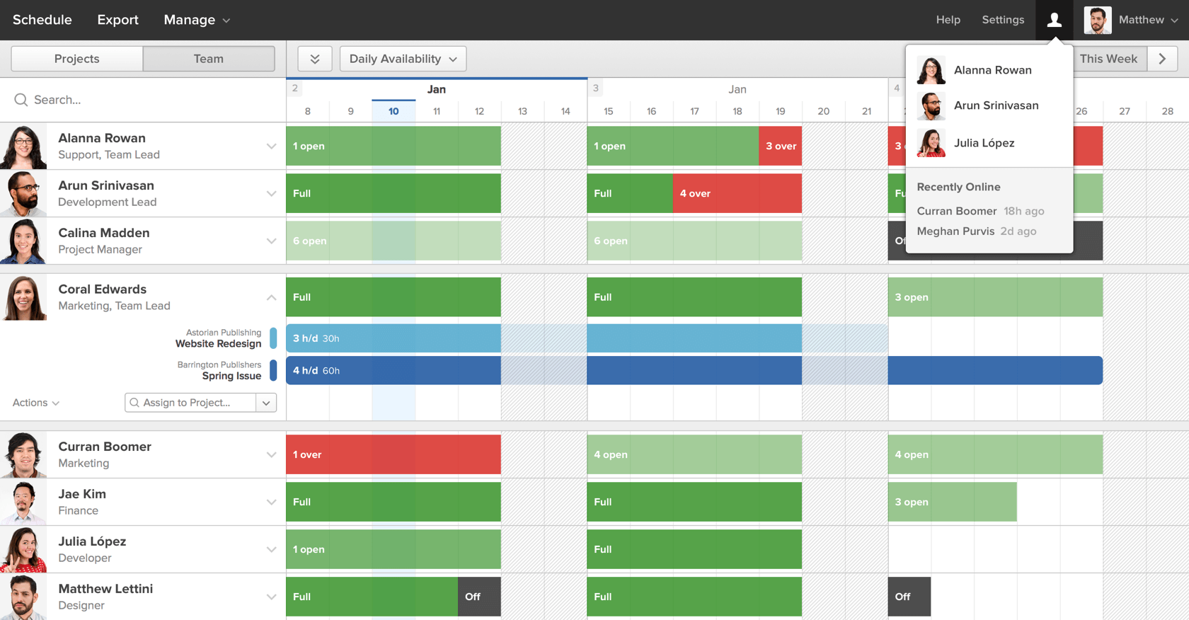
Through extensive research, we learned that many customers typically plan their teams with clunky spreadsheets. These sheets lack the ability to quickly pivot when plans change and are frequently out-of-date. It’s a heavy-handed approach we wanted to modernize.
We spent about a year prototyping different Forecast designs with beta customers. We found a solution in a design that’s heavily influenced by editing software like Garageband, offering a visual and fluid experience. It supports options like click-and-drag, splitting, moving, zooming, timeline shifting, real-time updating, and more. These features combine to bring real flexibility to managing a team’s time.
We also played with various trade-offs around scheduling projects versus scheduling people, and ended up creating two views of the same information. Customers can seamlessly flip between the two depending on what questions they need answers to (e.g. “What work is coming down the pipe?” versus “Who has availability next month?”).
As the designer and product lead, it was my job to make the experience of using Forecast easy, learnable, and delightful. Here’s a rough but extensive demo I created for our beta customers prior to the official launch, which demonstrates many of the core concepts and UX that still define the app today:
Beyond the 2014 launch, our team continued for years to improve Forecast based on customer and internal needs. We iterated on behind-the-scenes flows like billing and onboarding, helped unlock insights with reports and exports, and added many features that enhanced the core experience. You can see some of these updates on The Harvest Blog, but here’s a couple demos of some later highlight features, narrated by my wonderful coworkers:
I worked on Forecast for five years until an organization shift in 2018. It’s always a fantastic experience to both ship a product from scratch and continue to iterate on it based on paying customer feedback, and love the team you work with. I could talk your ear off reflecting on what I learned, what we did well, and what we could’ve done better.
Forecast offers customers an important birds-eye-view of their upcoming work and helps them plan around who’s doing what and when. Today, Forecast helps schedule over 82,000 purchased seats and contributes a significant amount of revenue to Harvest’s business. You can learn more and even try it out at https://getharvest.com/forecast (I also designed the marketing site).