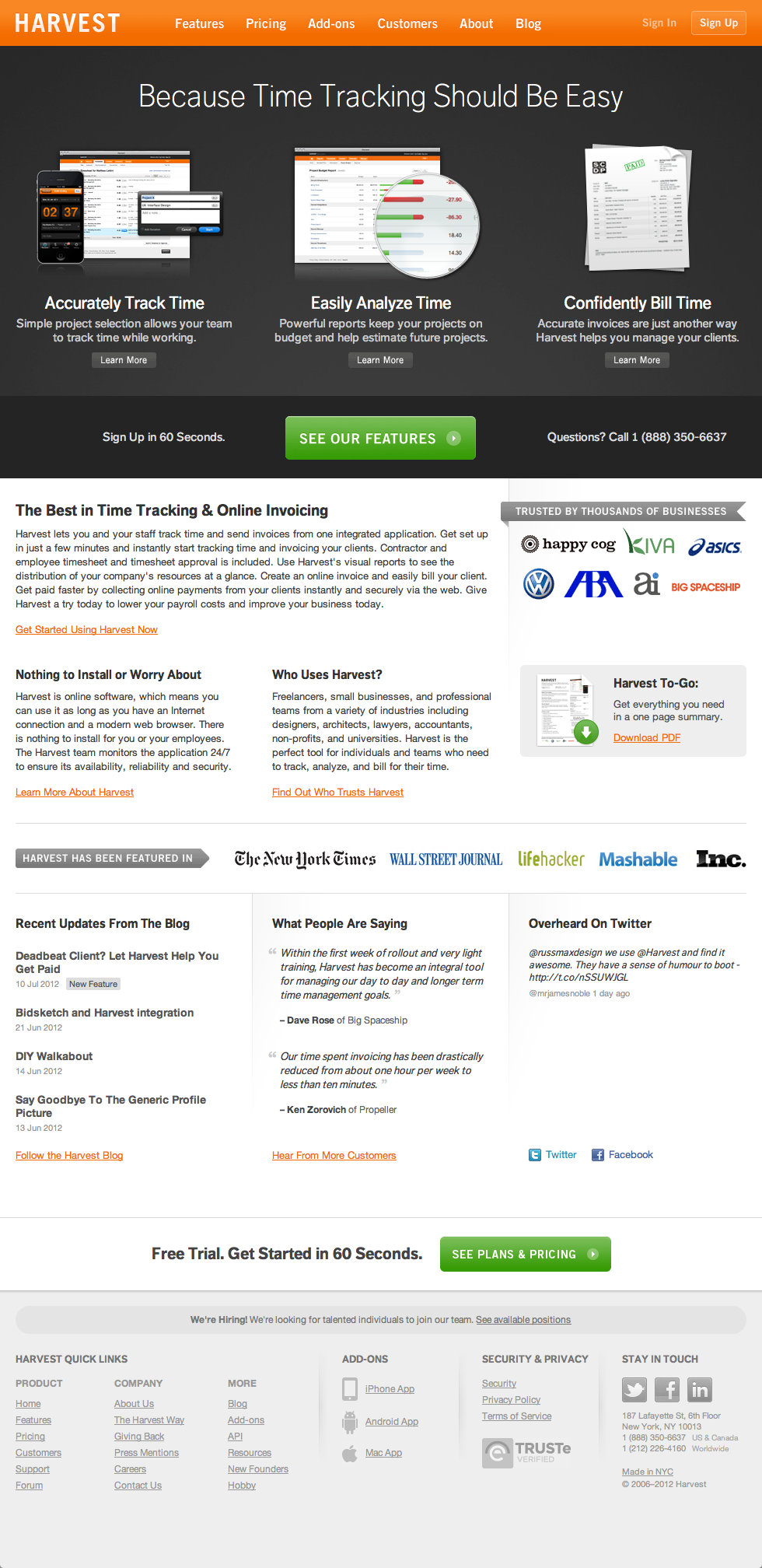
When I joined Harvest in October 2010, I was the sole designer on the team. This meant I was tasked with designing more than just the product. Working alongside the marketing team, I redesigned our entire GetHarvest.com website a number of times during my tenure (until we eventually hired a dedicated marketing designer). I was responsible for all design and code.
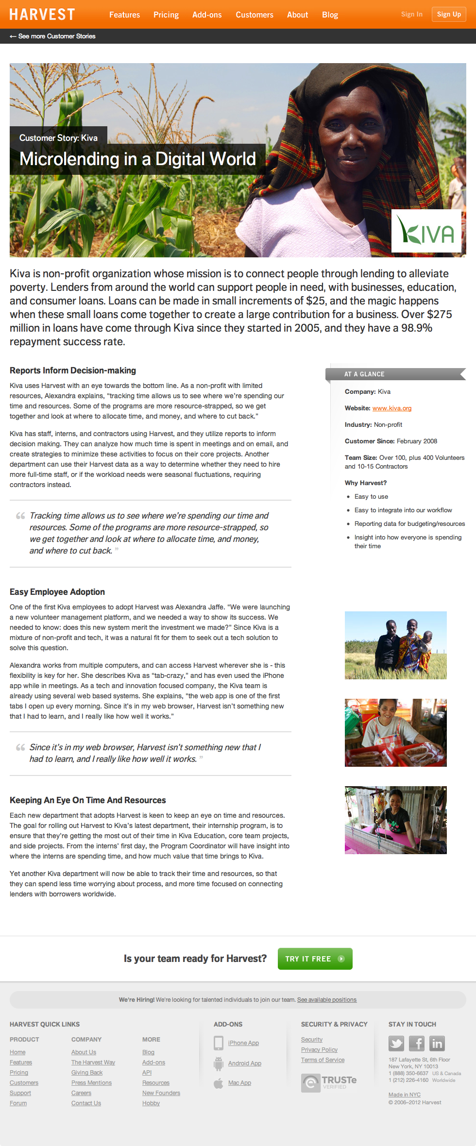
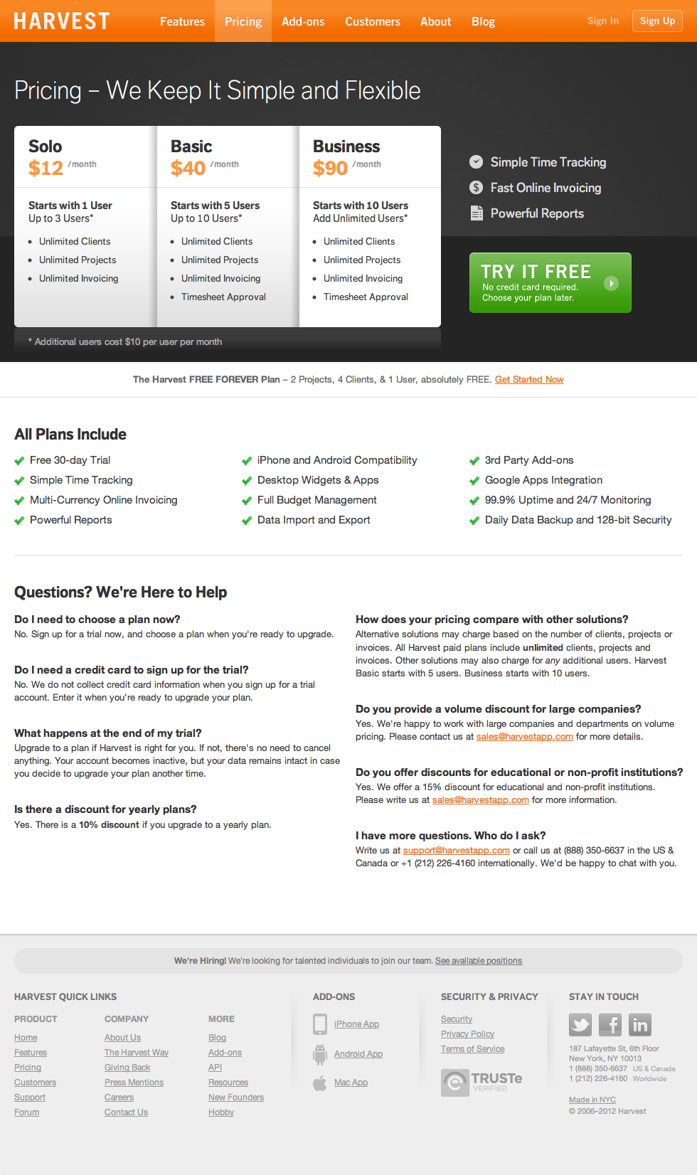
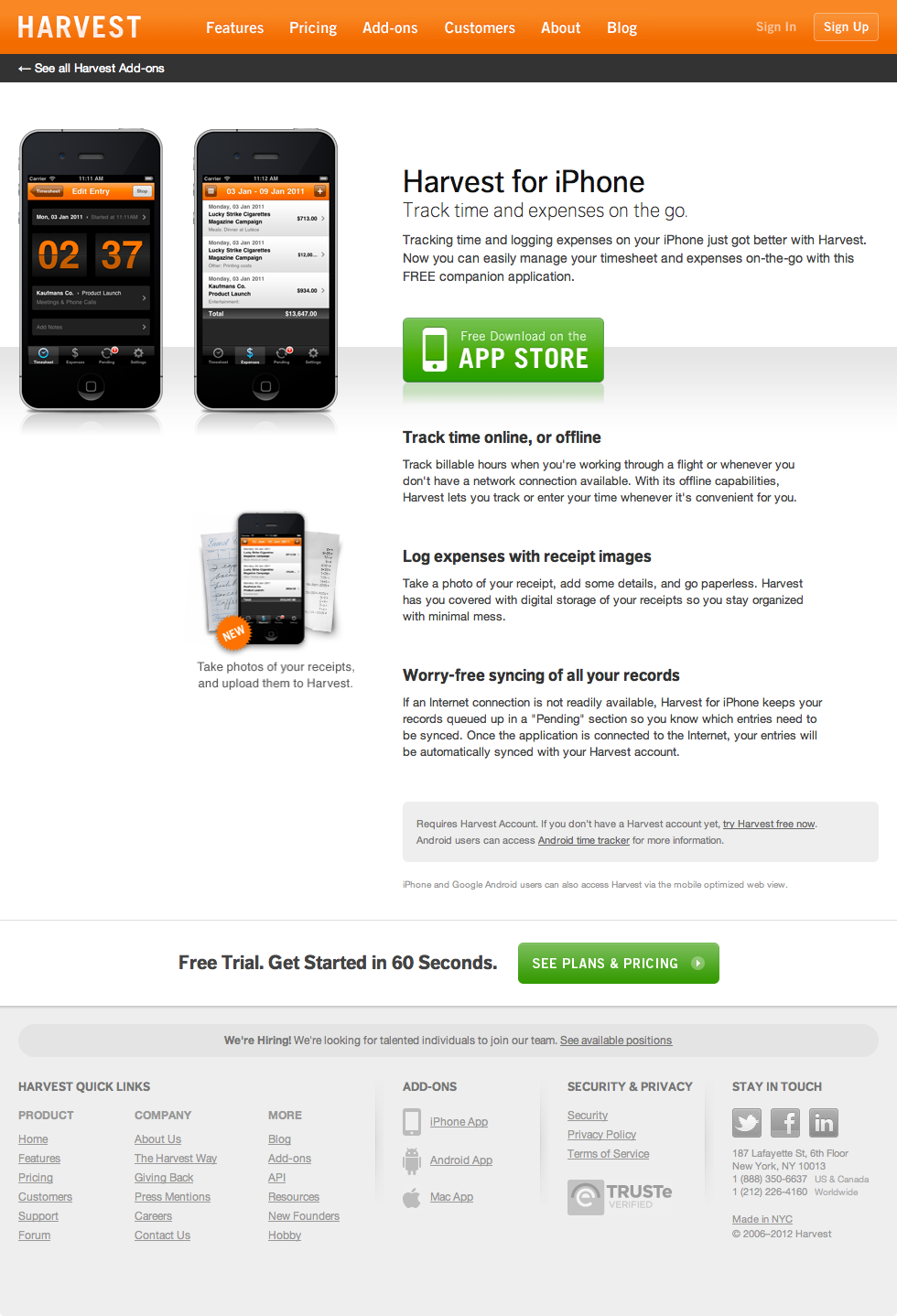
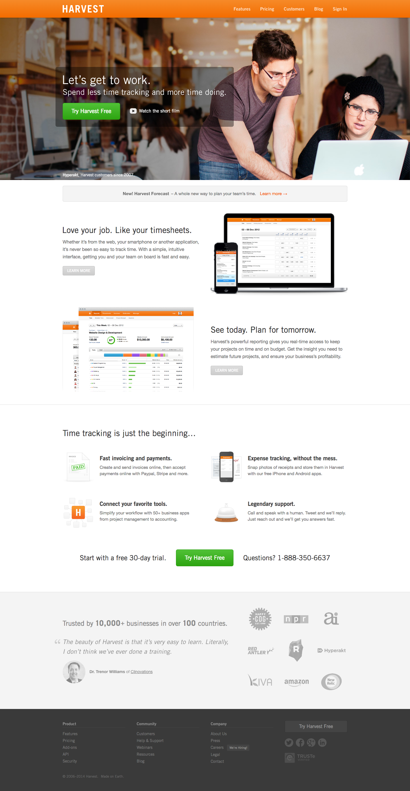
Both designs proved highly successful, and Harvest saw tremendous growth throughout the first half of the 2010’s. Below are just a handful of screenshots to capture the overall look of each design—I won’t make you scroll through the many many pages of content.
2010 Redesign
One of my first projects at the company, our initial design for GetHarvest focused on communicating the core tenants of the product: track your time, analyze it, and invoice it. It’s what we do best and we make it simple.